

standard size for android mobile app design
An ultimate guide to selecting the perfect artboard size for mobile

Since I started to design products, I fell in love with mobile UI Designs, but the only thing that always causes trouble is to select perfect Artboard size for both Android and iOS.
I think everybody faced the problem for selecting the right artboard size, be it in Sketch App, Adobe XD, Adobe Photoshop, Figma, Framer, etc…
I have been calculating different screens, dpis, dips, pts, pixels, etc… and tried to find the best way to increase productivity without spending and wasting time to select perfect Artboard size for Mobile UI Design
Why tho? It's already available in softwares, just click A or F bro…
Yes I kn o w, by selecting a preset artboard you can easily create an artboard and start working on that. But problem starts when there are different values in each software for different sets of devices.
Most of you have checked the prototypes in your smartphones and saw the disturbing inner bezels, just because of wrong or default selection of artboard.
In Adobe XD, you have 412X847 for Pixel 3XL and 412X870 for 4/4XLAndroid, in Figma you have Pixel 2 with 411X731 value; I have to use 4–8–12 point of spatial grid system and this size contradicts with that.
Aspect-Ratio matters the most
Aspect ratio is primarily dictated by the size of your camera's sensor, taken from the width and height of an image (W:H).
The aspect ratio of an image describes the proportional relationship between its width and its height. It is commonly expressed as two numbers separated by a colon, as in 16:9. For an x:y aspect ratio, no matter how big or small the image is, if the width is divided into x units of equal length and the height is measured using this same length unit, the height will be measured to be y units.
In simple words, it is a ratio between height and width of a scalable resolution of an image or a screen.
16:9 is most popular aspect ratio, due to its considerable width, this format is considered panoramic. In other words, it captures a wider area than other aspect ratios. In the late 2000s, it surpassed the 4:3 video format in popularity and is now the standard for television and online content.
Modern smartphones companies are racing towards larger screen and better resolution, day by day. But due to vertical nature and average width of holding a smartphone, companies maintain width within a ratio of 9 and increases the height i.e. 16 (panoramic ratio).
dp (Independent Density Pixels) or pts (Points) or pixels ?
While handoff you can select whatever metric you want to select for particular OS, but while designing you can work only on pixel values. How?
It's simple maths actually!
Prerequisites:
1. Aspect ratio of device you're designing for, most common aspect ratios are-
- 12:9 or 4:3 (iPhone — 4s, downsampled), (Old Android devices)
- 16:8 or 2:1 (Old Android devices)
- 16:9 (Standard panoramic ratio), (Android devices till 2017 includes Nexus and Pixel series), (iPhone5 — SE, downsampled),(iPhone 6,7,8 and plus models)
- 18:9 (New Android smartphones e.g. Pixel 3 and Pixel 3 xl)
- 18.5:9 (New Android smartphones e.g. Galaxy S9 and S9+)
- 19:9 (New Android smartphones e.g. Galaxy S10 & Note 10 series, Pixel 4 line up)
- 19.5:9 (New Android smartphones e.g. OnePlus 7 series)(iPhone X, 11 and 12 series, upsampled)
- 19.8:9 (OnePlus 8 Series)
- 20:9 (OnePlus 7T, Samsung Galaxy A70 & A8, Galaxy S20 series)
- 21:9 (Xperia Devices, Motorola one, Samsung Galaxy Fold, Galaxy Z Flip)
2. Screen resolution of your device (Google it for ease)
Here comes the calculation part:
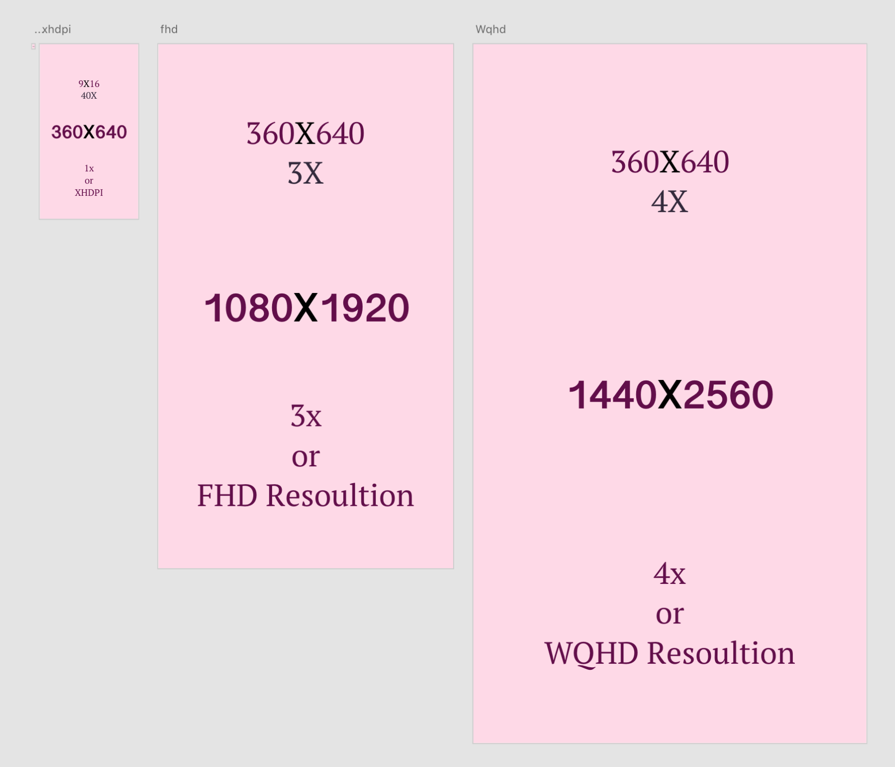
Let's assume, 1dpi (dots per inch) = 40 (minimum visible amount of content area per inch)
To get artboard size for your UI design you have to multiply aspect ratio of your mobile device with 40, for an e.g. for Galaxy S10, I have to multiply 19:9 with 40, which will give me an Artboard size to work on (it will help me to export and render the same design for any screen within 19:9 ratio)
19 X 40 = 760; 9 X 40 = 360
Hence the size of an artboard is 360X760 (portrait or vertical orientation)
For an iPhone X, it would be
19.5 X 40 = 780; 9 X 40 = 360
But as you have noticed that Artboard size of iPhone X in softwares and guidelines is always 375X812 and it's due to the resolution of screen Apple provides. Higher density in screen results a specific Render rate (which is 3x in case of iPhone X) and to maintain the resolution of 1125X2436, they upscale the size of independent points.
You can duplicate Worldwide Stat Figma Frames on Figma community to get updated artboard sizes based on data from Stat counter.
Remember? I said Figma and Sketch uses a preset of 411 width and 412 width for Pixel 2 devices?
Well, teams at Google Design, Android Developers and Material Design are just doing the same with their real time device designs.
I recently asked these teams at Twitter about If they have any plans to update the Material Guidelines:
Hi teams at @GoogleDesign @Google
Will you be upgrading the @materialdesign guidelines?* In the guidelines you mention to use 4 and 8 point spatial grid layout and 360dp breakpoint for Android phone, which makes sense by all means of calculations.
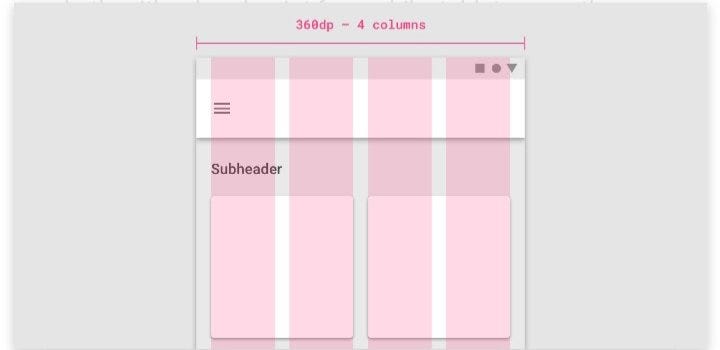
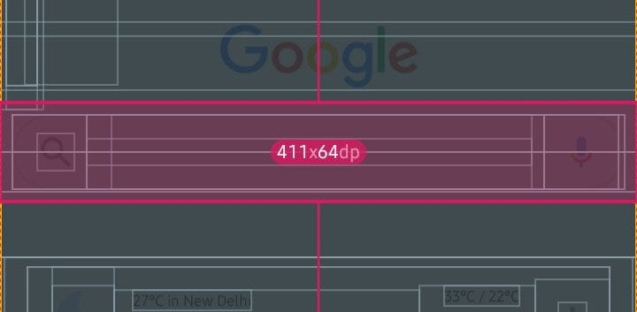
But on every new Android device (including @GooglePixels series), the breakpoint for maximum width is 411, which cannot be calculated as per @materialdesign guidelines and spatials grids. Also, in the new @GooglePlay store and @Google Podcast UI design, there are no shadows or divider lines, and this is not mentioned in @materialdesign. But the main issue with 411 breakpoint is to calculate while designing for each and every view, layout and components.
I was reading a blog of my friend Molly Hellmuth — "Everything you need to know as a UI designer about spacing & layout grids".
She also recommend to use 4–8–12 point of spatial grid system for your designs, but it seems Google is not focusing on how designers will distribute the components according to 411 breakpoint while designing for UIs.
Conclusion
So after this short article, hopefully you've learned something. Let me quickly summarise all that I've said.
First of all, you should always get that smartphone manufacturers do manipulate(upsample/downsample) the screen resolution and independent pixel/point size to differ from others, likewise clocking speed of CPU and GPU. Then after you have to set a size of an artboard according to device you're using to test or target with the help of above calculation, and start creating the designs that you think will work. I hope Google or Android team will read this and reply to the most important question of UI design space for Android.
If you liked my article, meet me at Designer's Virtual Cafe and say "Hi 👋".
Buy me a Ko-Fi ☕ and support my content by pressing 👏.
You can write to me directly via WhatsApp or find me on Instagram or Dribbble as @appy013
standard size for android mobile app design
Source: https://uxdesign.cc/perfect-artboard-size-c267939c5843
Posted by: tovarmastakill.blogspot.com
0 Response to "standard size for android mobile app design"
Post a Comment